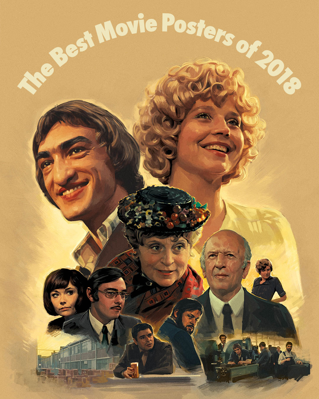
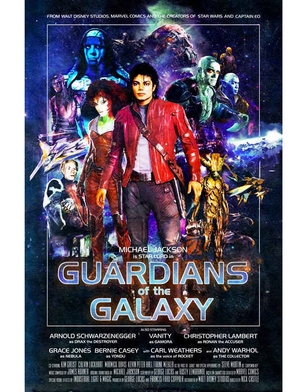
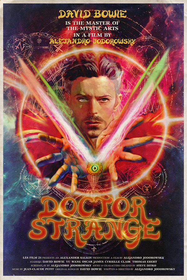
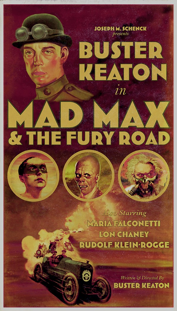
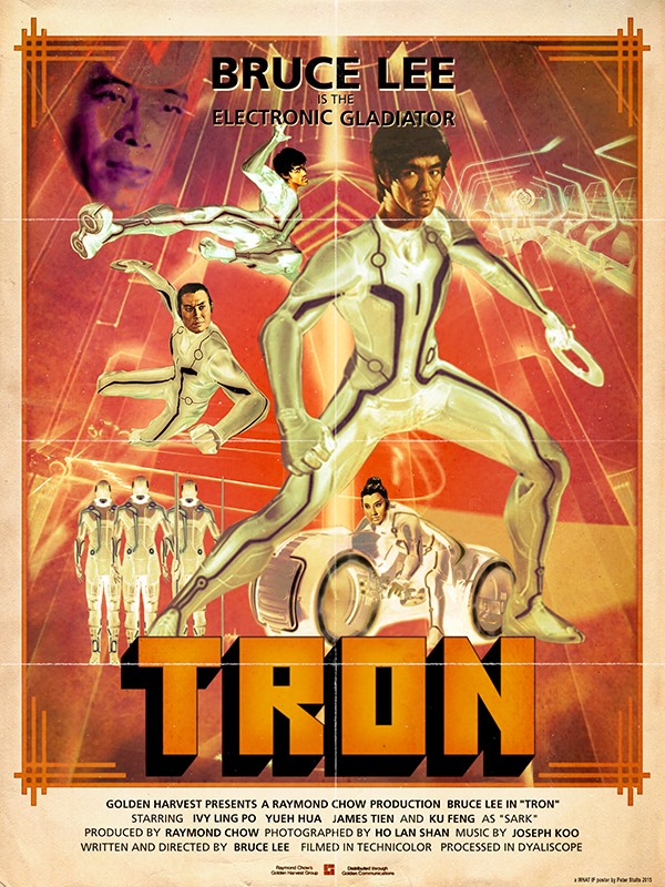
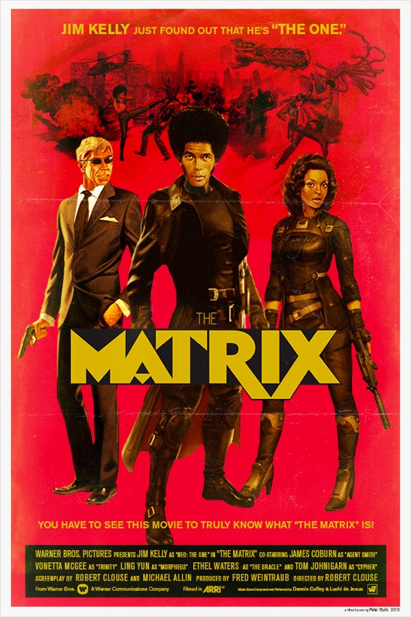
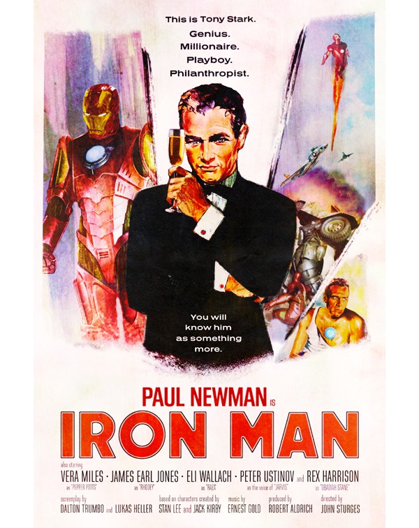
Illustrator Tom Stults imagines what the posters of popular movies would look like in an alternate universe…if they’d been made earlier or later or in a different setting. He’s done dozens of these…the latest “What If…” set is here with links you can follow to his past sets. I could caption these but they’re pretty self-explanatory.
In the early 90s, a digital typeface designed in the 80s – but based on the letterforms used in a Roman column completed in 113 AD – became the go-to typeface for movie poster designers. (Reminder: everything is a remix.) It was used on posters for movies like The Bodyguard, Crouching Tiger Hidden Dragon, Children of Men, and Quiz Show. This Vox video details the rise of the Trajan typeface in movie poster design and why its not used that often by big movies anymore.